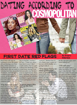
This is the first page of my Newsletter. I wanted to use bright, bold colors to catch the eye. I thought because the title of the story featured on this page is RED flags, I'd stripe the title in red. I used photoshop to create that sort of collage of Cosmo magazines. I also downloaded both of the title's fonts because I thought it went perfectly with the magazine feeling.
I used Microsoft excel for the graph and made sure all of the information was relevant to the topic of Dating. (The websites to each article and piece of information is also on the page in very small font in order to give credit). I thought that it would be fun to have the story told around a graphic because its more interesting to look at that way. Again, I downloaded nearly all of the fonts on this page. I also stripped the title again in order for it to really pop.
With the last page, I stayed with the pink and the bright color theme. I chose to put a border around this image in order for it to pop more. I filled my extra space with advertisement relevant to Cosmo.
|
AuthorWrite something about yourself. No need to be fancy, just an overview. ArchivesCategories |